How to Design an E-Package Marketplace
The hardest part about designing an event marketplace is, parties come in all shapes and sizes. To streamline the booking process, it’s important to layout your marketplace strategically. You want to lead clients to the perfect event, so they aren’t left confused by a sea of event packages.
STEP 1
Help your customers find the right package
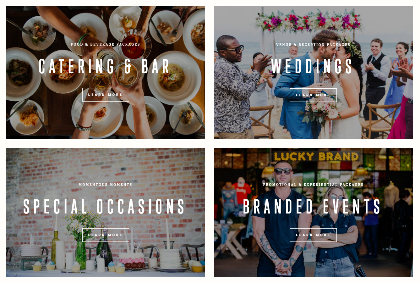
When a potential customer lands on your homepage, the first thing they should interact with is your marketplace. So clients know your website is interactive, use statements in the headlines like, “Let’s Get Started” and “Select Your Event Type”.
Start off by showcasing categories of the event types that you offer. You want to make it easy for potential customers to quickly find the type of event they are looking for.
STEP 2
Make navigating your marketplace simple
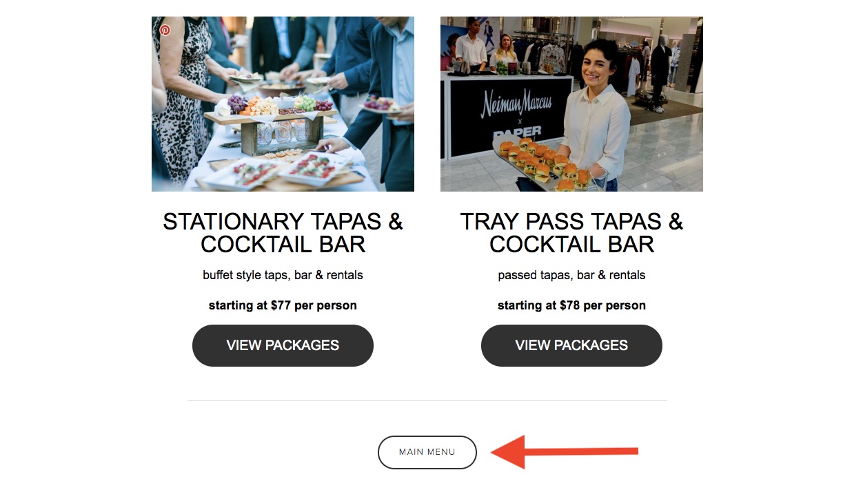
Make it easy for clients to navigate your marketplace. If you give them too many options at once, they will begin to feel overwhelmed. It’s better to create a step-by-step process. Offer a few options at a time that leads the client to the right package.
Use a “Main Menu” button so clients can easily go back without going to your homepage. One of your main objectives should be, keeping customers in the marketplace and away from your event inquiry form.
STEP 3
Great product descriptions are key
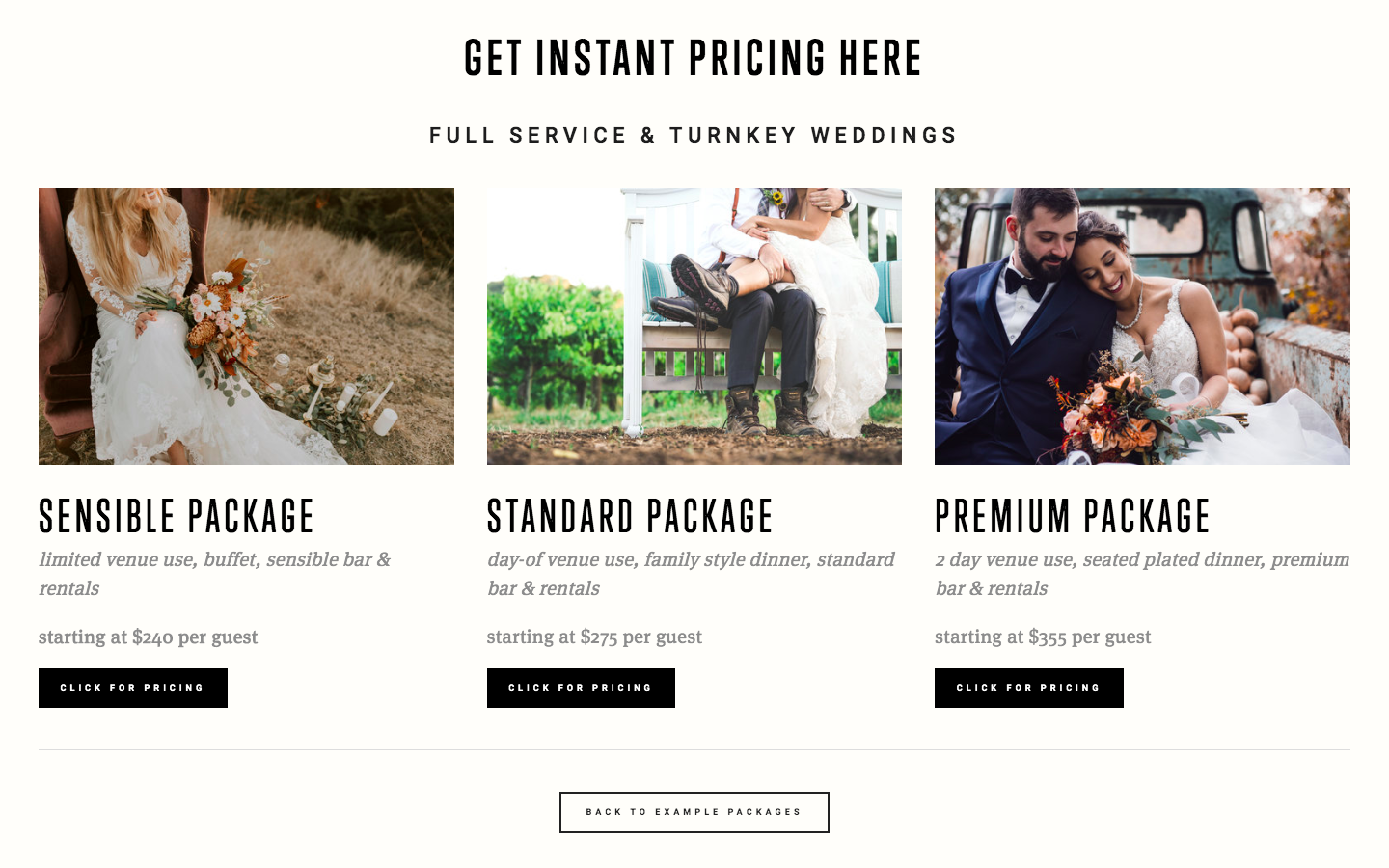
Once a potential client finds the right type of event, they’ll need to pick out the perfect package. Most people plan with a budget in mind, so be sure to offer multiple packages at different price points. Be transparent with your pricing by listing a base price for each package in the description. There’s no point in generating a lead that can’t afford your service.
Use beautifully curated photos to showcase each package. Include a brief description of the event. Highlight venue options, catering styles, rentals, etc.
For the button text, steer clear of phrases like, “Instant Proposal” or “Get a Quote”. Customers tend to read the words, “quote” or “proposal”, and think they’re about to have to fill out a form and wait for pricing. Use verbiage like, “CLICK FOR PRICING”. The more direct you are, the better.
Want to learn more?
rapid growth starts here
book a demo


